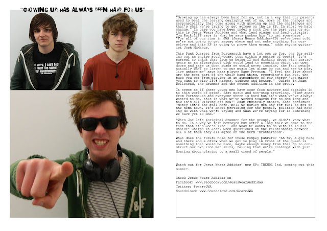
 |
| Had to re upload due to problems with exporting |
Kane Preston's AS Media Blogger
Friday, 19 April 2013
Question 7
Question 7: Looking
back at your preliminary task, what do you feel you have learnt in the
progression from it to the full product?
Throughout the task, I have noticed my understanding of the
codes and conventions has improved, thus making my product seems better than my
original College Magazine compared to my new Music Magazine.
I feel that as I have stuck to a strict plan of what I
wanted to do, rather than making it up as I go the along and following a very
bare and unhelpful plan, have made this product improve dramatically. Also
knowing who I my audience was and doing thorough research on a certain audience
which have a very niche set of interests rather than having a wider audience
where the only thing in common is there age and occupation. Whereas my music
magazine allowed me to go deeper into whom I was making the product for and how
I can make it more appealing to them.
Being an amateur, I felt it was vital for me to get to grips
with software such as in design and Photoshop and try playing around with
different editing styles such as the images and font I used for the text. I
only had basic knowledge of both of the editing software so I felt it was vital
to keep the product basic and to not over do certain things as this may lead to
the product looking over crowded and ‘tacky’.
I felt that the design of the contents went well as I used
very little in terms of design and used contrasting colours to get the
contents, normally a very dull and un-interesting part of any magazine, to look
vibrant and alive even though it is a very basic design. I tried repeating the
same ‘Less is Best’ idea to my double page spread. I originally wanted to have
the band parodying another famous-ish album cover (I was thinking either London
calling by the Clash or Morden World by the Jam) but I was unable due to time
restrictions and meeting deadlines. I also believed it would be too time
consuming in terms of editing the images. Instead I went with simple the simple
route with nothing to fancy and it has come out as I have hoped.
Looking through existing magazines played a large part of my
research; this allowed me to make my mind up pn what I was trying to do and how
I was going to do. I felt that the minimalistic approach that Q magazine went
for looked professional but I didn’t want to take my magazine too seriously so
I added more vibrant colours to the cover. Also understanding WHO my audience
was played an equal, if not more important, than looking at examples. I felt
that I had to get into the head of my audience, this lead to asking members of
my target audience of people what they would want to see in the magazine rather
than what I felt the audience would like to see.
Question 3
Sorry, I didn't feel comfortable talking in-front of my camera. So instead enjoy looking at my desktop.
Question 4 & 5
Subscribe to:
Comments (Atom)


